Selected work
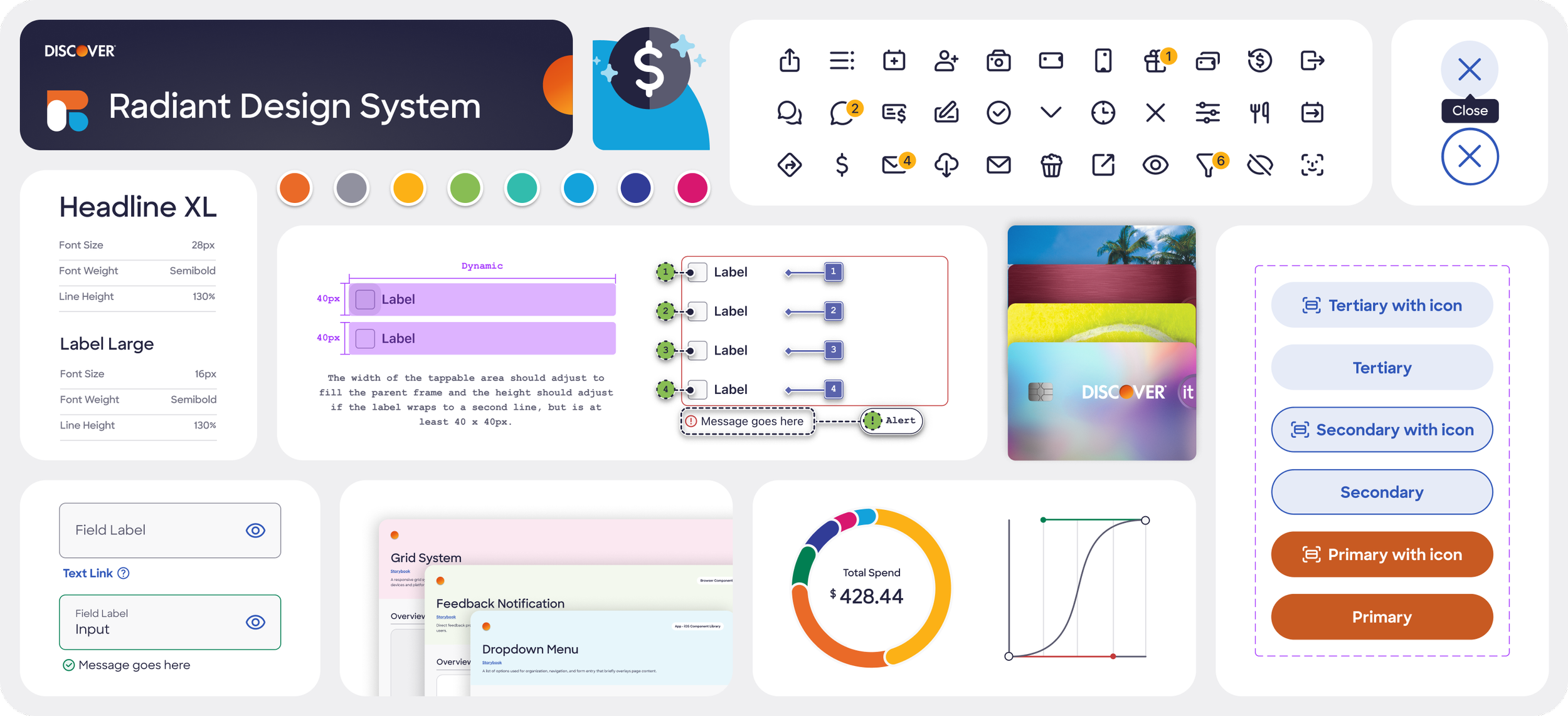
Discover Design System
Discover’s legacy design system struggled with redundant, non-scalable components, unclear documentation, and low adoption, creating inefficiencies and inconsistencies across teams.
To address this, we restructured the system into platform-specific libraries covering Foundation, Browser, iOS, and Android. With two other UI designers, I conducted audits and research to identify areas for improvement, built 20+ modular, responsive Figma components, and created detailed documentation for components and foundational elements. We also defined and standardized accessibility-focused UI interactions across components, ensuring consistent keyboard navigation and visual feedback with clear color contrast and interaction cues.
By meeting weekly, attending demos, and providing feedback to ensure design fidelity, we aligned component behavior, resulting in smoother QA, stronger cross-platform consistency, and improved design and development collaboration. The new system reduced redundancy, increased adoption, and streamlined workflows, establishing a scalable foundation for consistent product experiences across platforms.
200+ cross-platform components
60+ usage guidelines
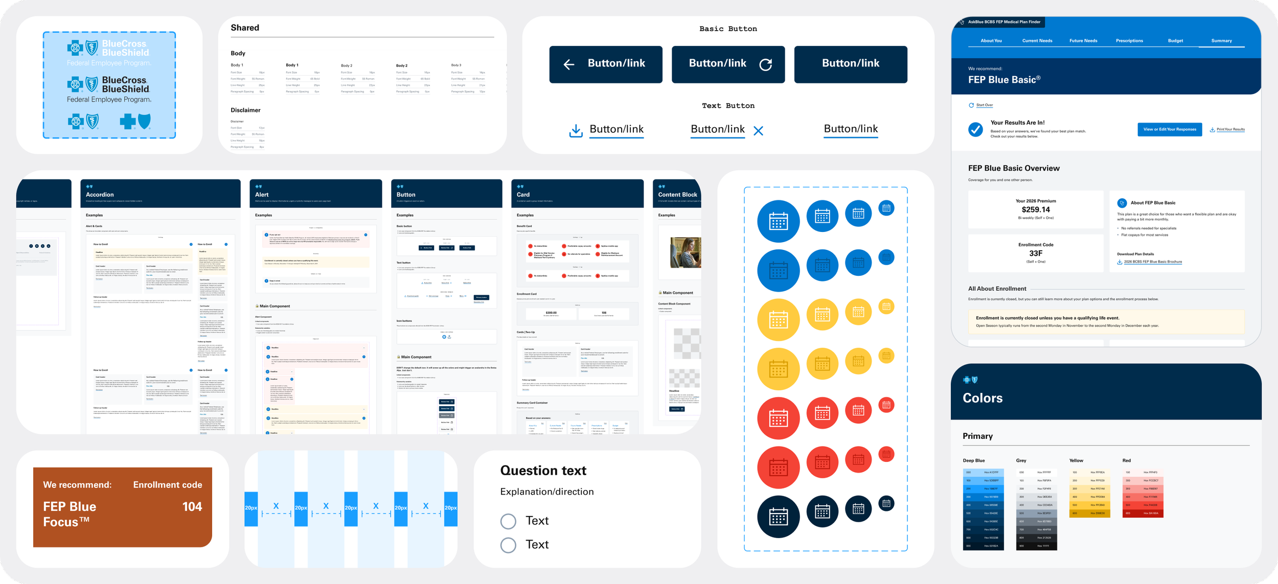
BCBS FEP Component Library Optimization
We inherited a fragmented UI library for Blue Cross and Blue Shield’s Federal Employee Program, marked by excessive variants and inconsistent styles. With only two weeks and no time for full code tokenization or documentation, I prioritized and led the system’s stabilization and simplification, guiding another designer to implement key improvements.
Shared BCBS visual styles were established in a dedicated foundation library to support FEP and sub-brands, creating a consistent, scalable base for their component libraries. We audited the system to identify redundant variants and duplicate components, then rebuilt them with Auto Layout, standardized properties, and constraints, producing modular, flexible builds. FEP’s streamlined library now serves as a model for future sub-brand libraries, defining repeatable design practices across products.
The project launched on time with a cohesive system, enabling designers to work with confidence, reducing complexity, and supporting efficient workflows across projects.
87% reduction in component variants
54% reduction in unique components
DinersClub.com Redesign & Design System
DinersClub.com’s fragmented information architecture and unclear user flows made it difficult for users to understand the card’s value and navigate content, especially on smaller devices. Outdated and inconsistent UI elements undermined visual hierarchy and limited scalability, amplifying usability issues.
I collaborated with another UI designer on the redesign, creating responsive screens, reusable components, and templates that allowed engineers to assemble pages without custom layouts. We refreshed the site’s look and feel to align with updated brand guidelines, optimized the mobile experience, and streamlined information architecture for clear, intuitive pathways.
We also developed a website manual covering accessible color combinations, typography, visual elements, and messaging guidelines. These updates improved discoverability, simplified the path to local application sites, and boosted engagement on mobile devices.
94% decrease in Click-to-Apply Exits YoY
228% increase in Mobile Visits YoY
Discover New Cardmember Journey
Discover’s cardmember registration, activation, and onboarding experience was overcomplicated, inconsistent with the brand, and not fully accessible, creating friction across web and mobile.
As part of a four-person design team (3 UI designers, 1 UX designer), I built high-fidelity screens and developed key components and patterns that later informed Discover’s Radiant Design System. Streamlining the user journey involved removing unnecessary questions, simplifying inputs, and aligning copy with the brand’s friendly, helpful tone. We delivered a mobile-first, WCAG-compliant design for iOS and Android, before adapting the flow and components for responsive web.
These changes reduced cognitive load, strengthened user trust, and improved adoption and completion rates for new cardmembers. Users with diverse accessibility needs awarded the updated experience a SUS score of 86, demonstrating excellent usability and inclusive design.